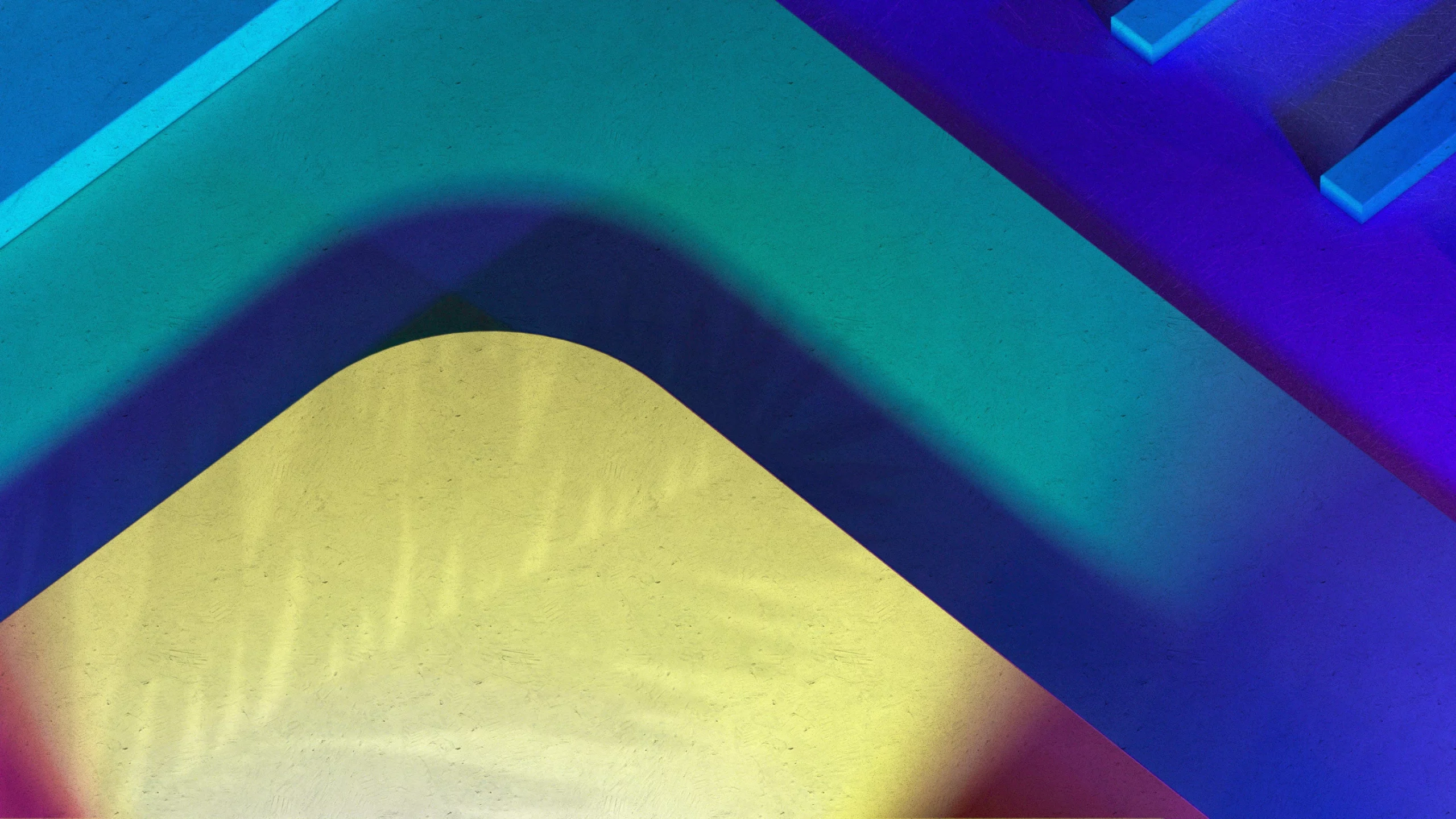
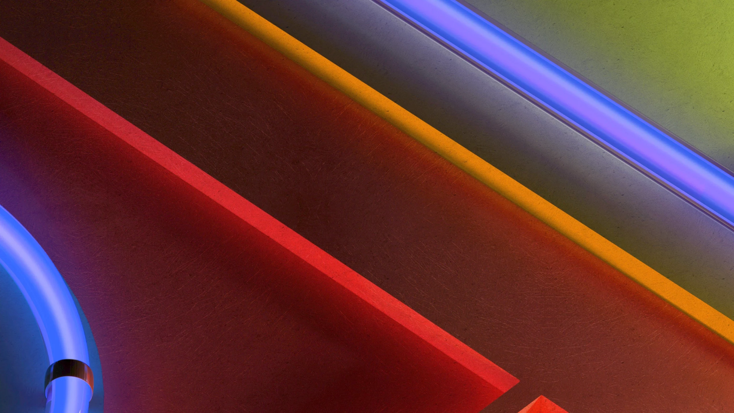
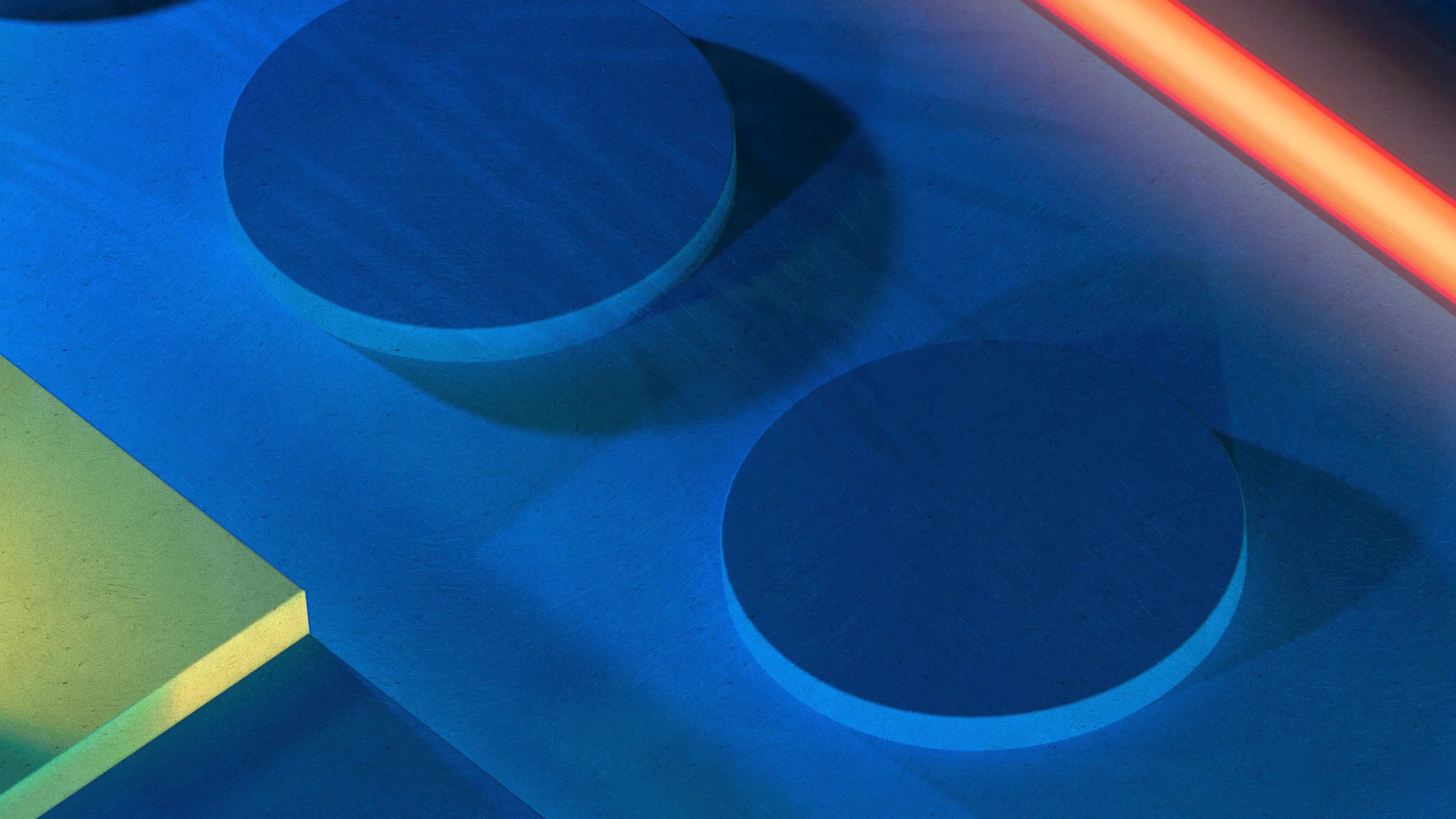
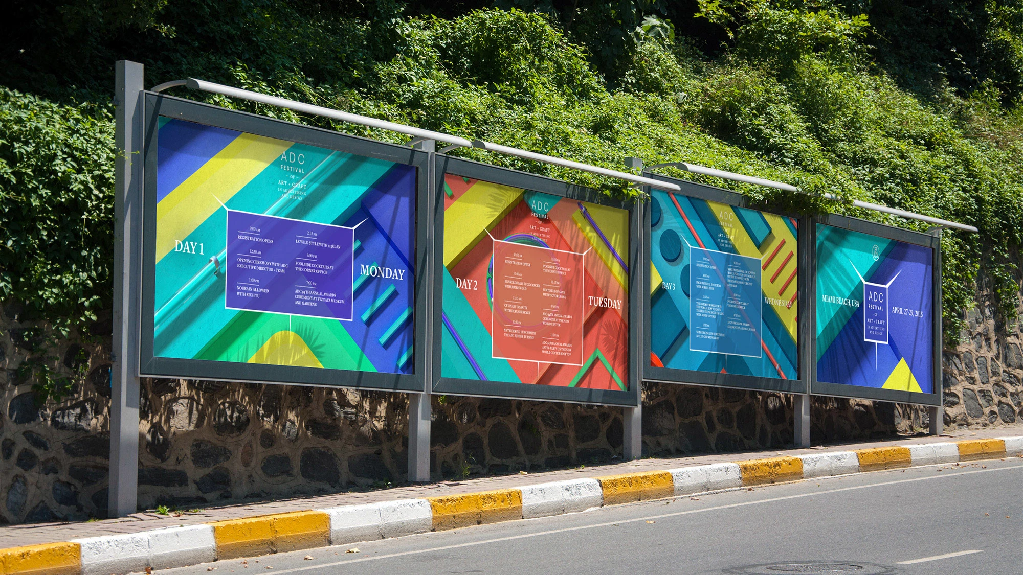
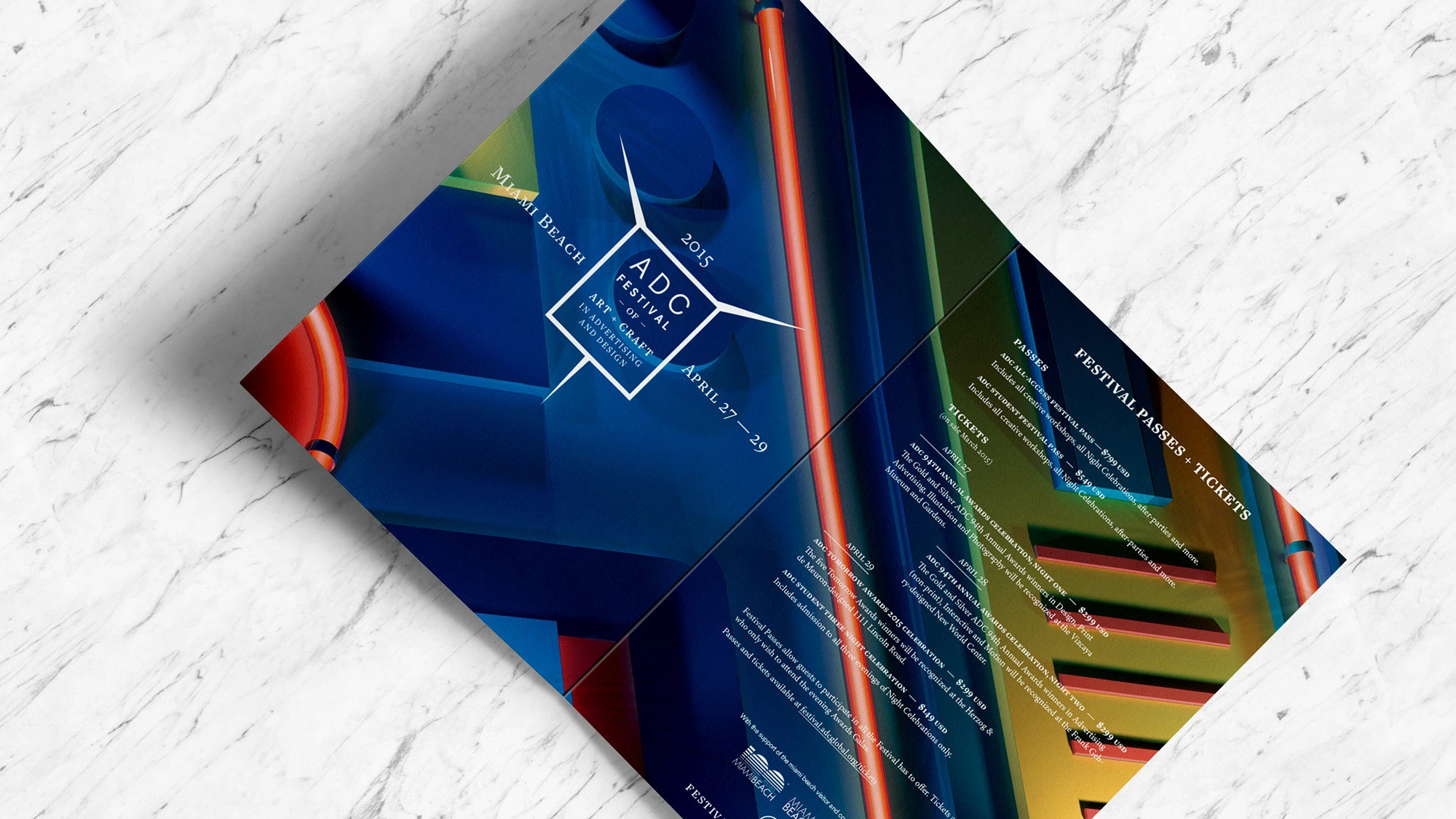
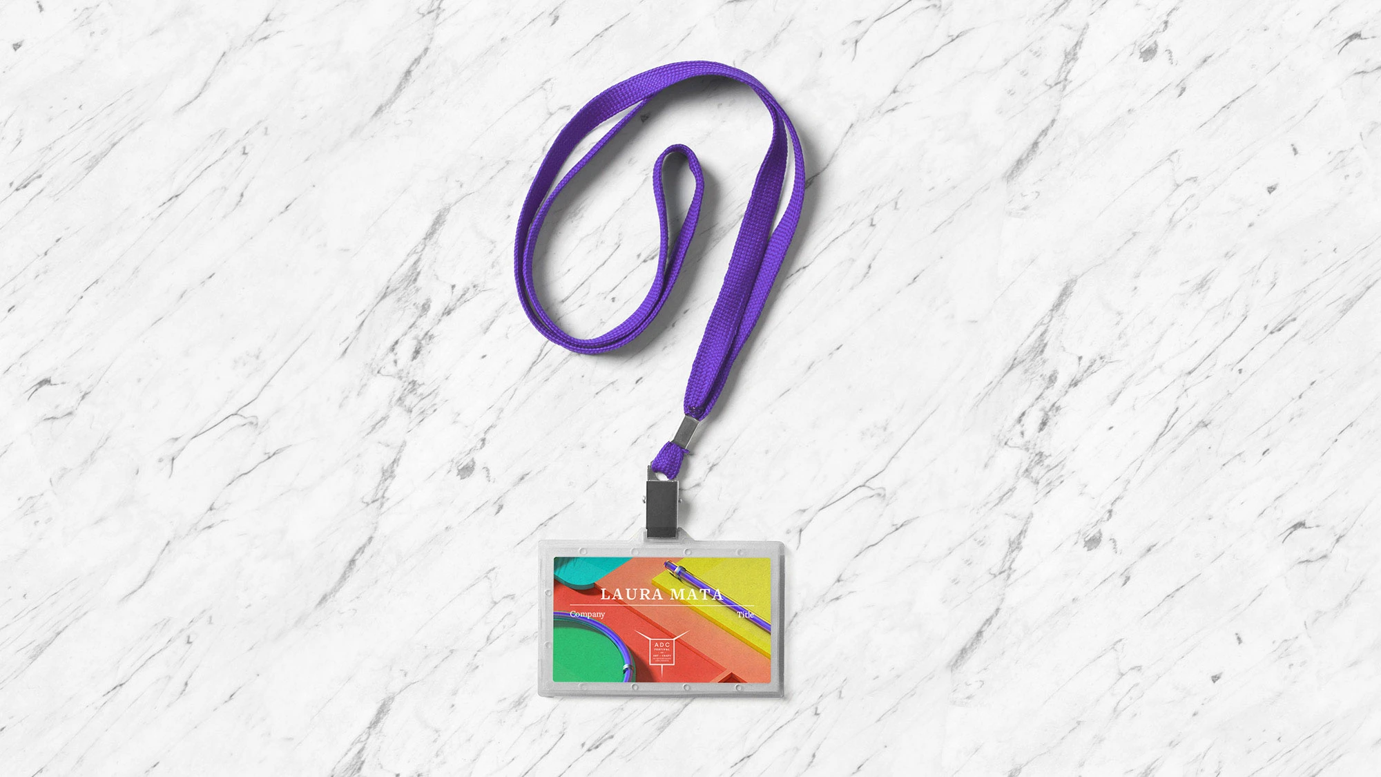
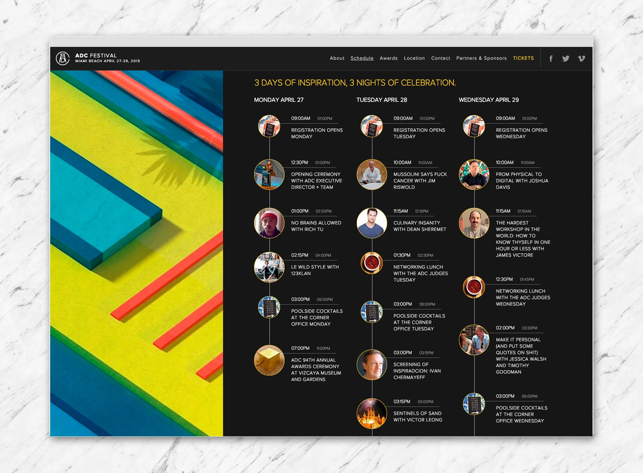
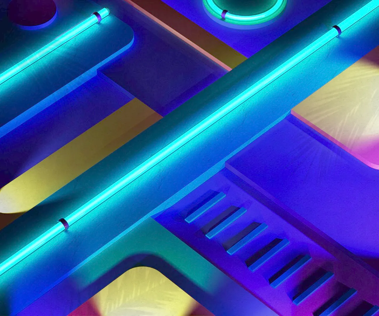
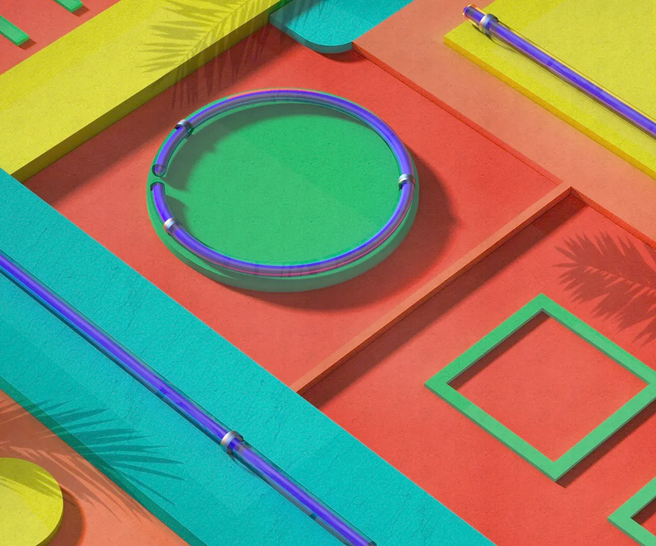
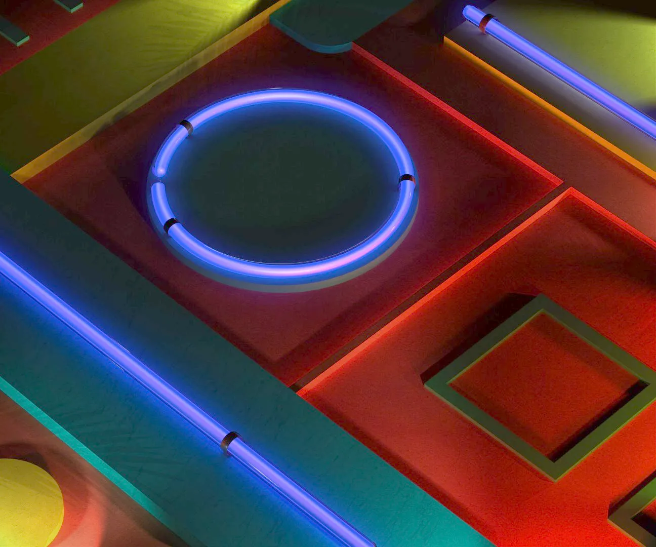
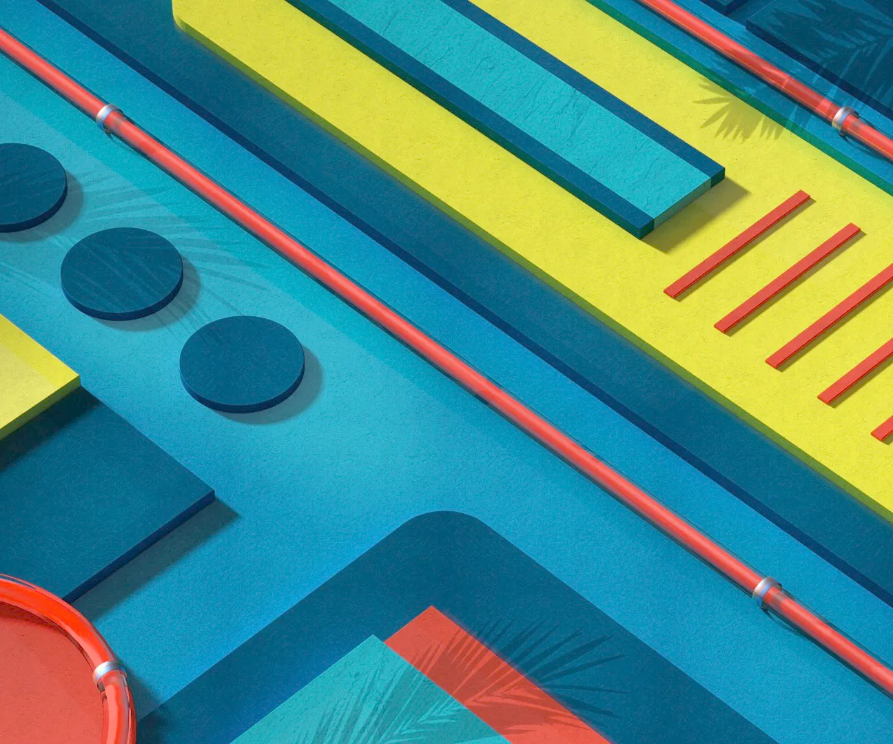
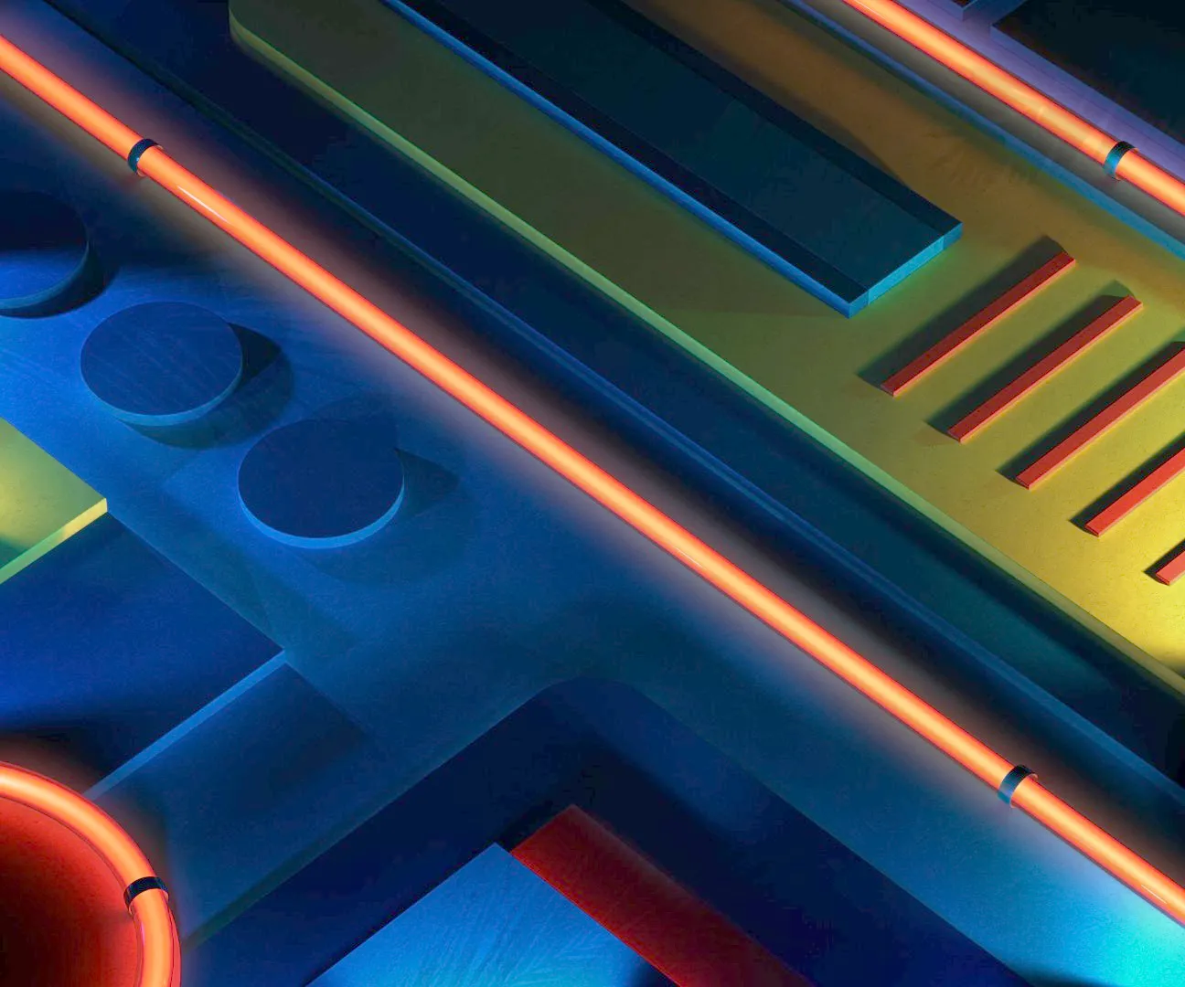
Re-imagining the 2015 identity for ADC Festival, inspired by Miami-Beach spirit and Art-Deco architecture, carried through 3D motion and vibrant colors.
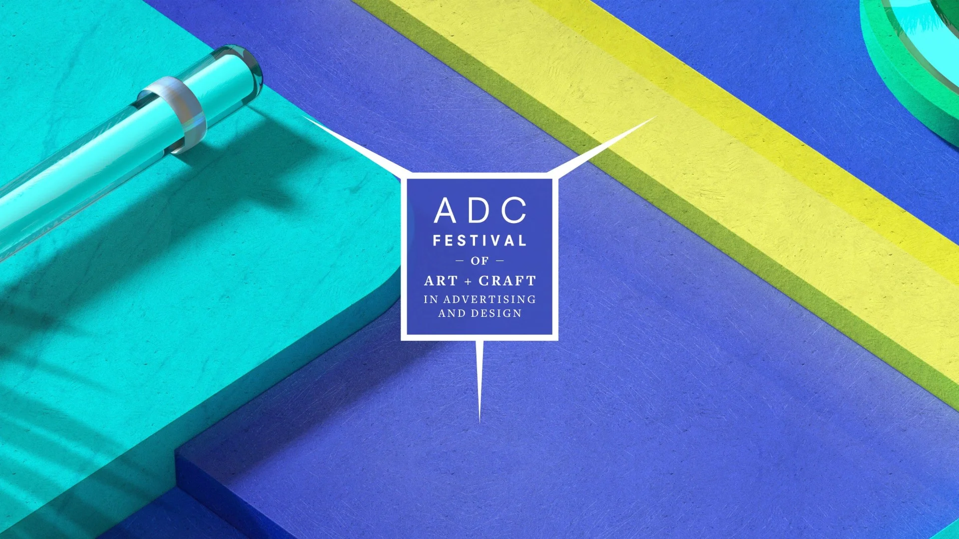
After the 2014 ADC Festival rebranding the client asked to evolve the concept and stay ahead of expectations for 2015. The 2015 identity draws on the nature of the festival combined with the character of Miami Beach: Art-Deco styled architecture and a layered sense of construction “from base to top”. The outcome is a rebranding full of colors, with a coherent visual language that connects strongly to location, architecture, and dynamic motion.
My role
I created all the 3D design and animation used for the identity.
Modeling, shading, lighting, rendering, and motion development were entirely in my hands.
All the visual assets and animated sequences originated from my pipeline and formed the core of the final identity
Creative Approach
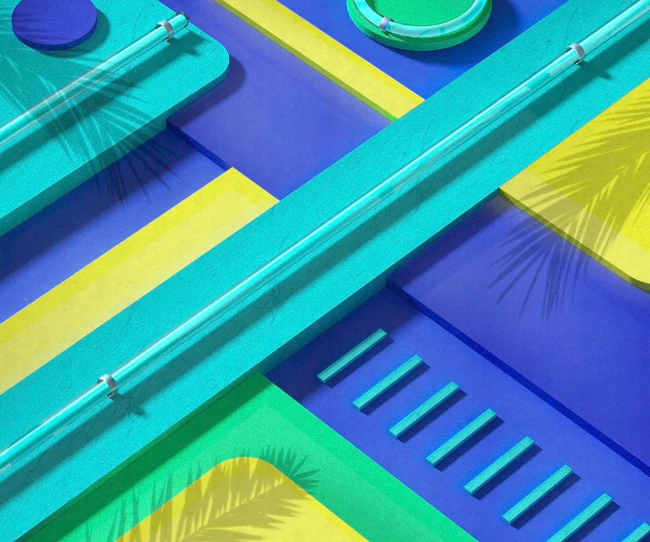
Starting from the architectural character of Art-Deco and the vertical “construction from base to top” idea, I translated that into modular 3D structures ready for animation. I built a versatile 3D library that could evoke both structural solidity and fluid motion. Color and light were used to reinforce place: warm tones and vibrant hues to hint at Miami Beach mood, combined with clean geometric motion to keep the identity elegant but dynamic.
Step by step:
Designed modular 3D geometries inspired by Art-Deco architecture and structural layering.
Developed materials and lighting setups that allowed flexibility across different outputs.
Created motion sequences that emphasised build-up, reveal and movement — resonating with the “from base to top” concept.
Rendered the 3D scenes and delivered animation assets for adaptation across event visuals, print, screen and motion formats.